S-O-U-P | The Urban Future Festival
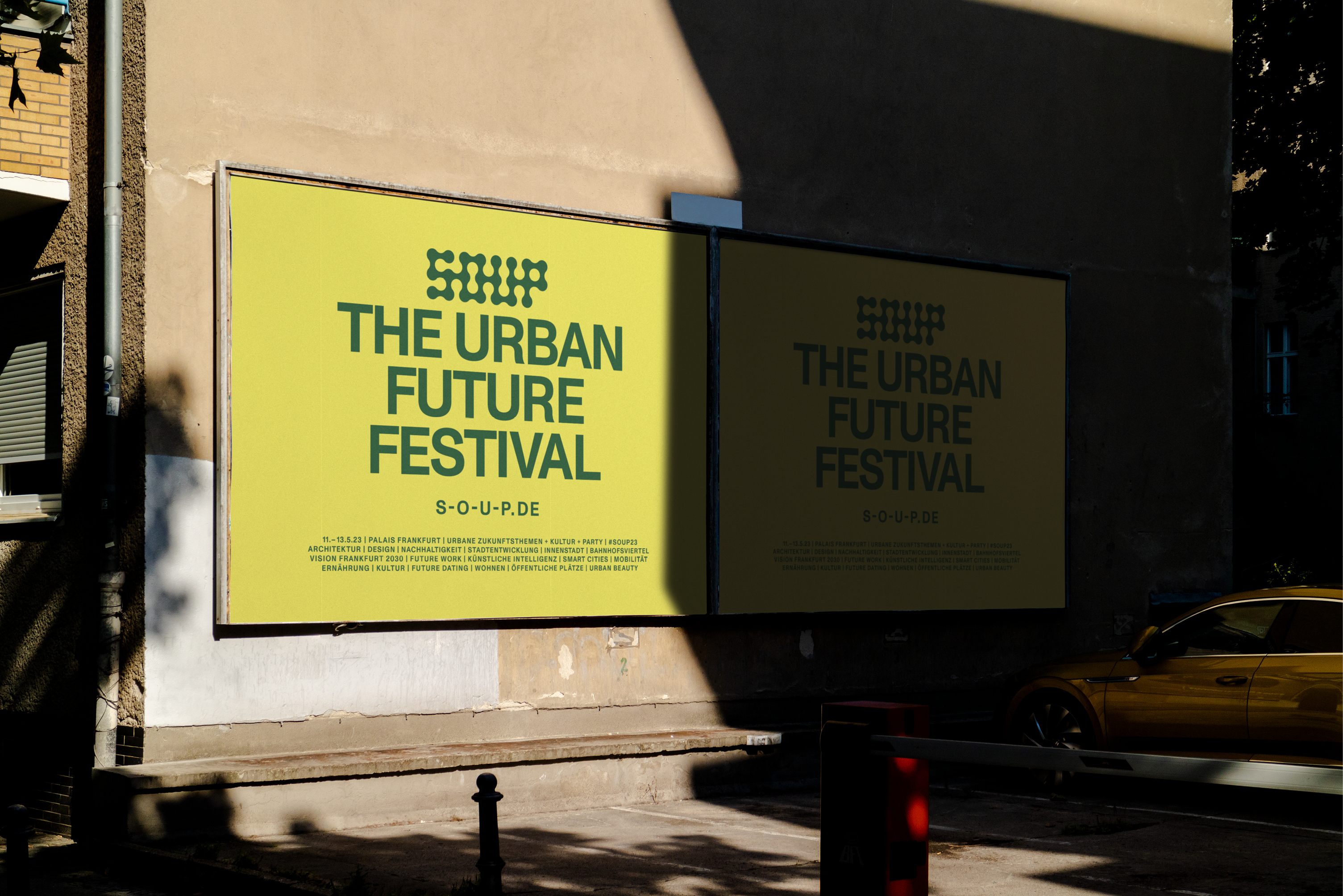
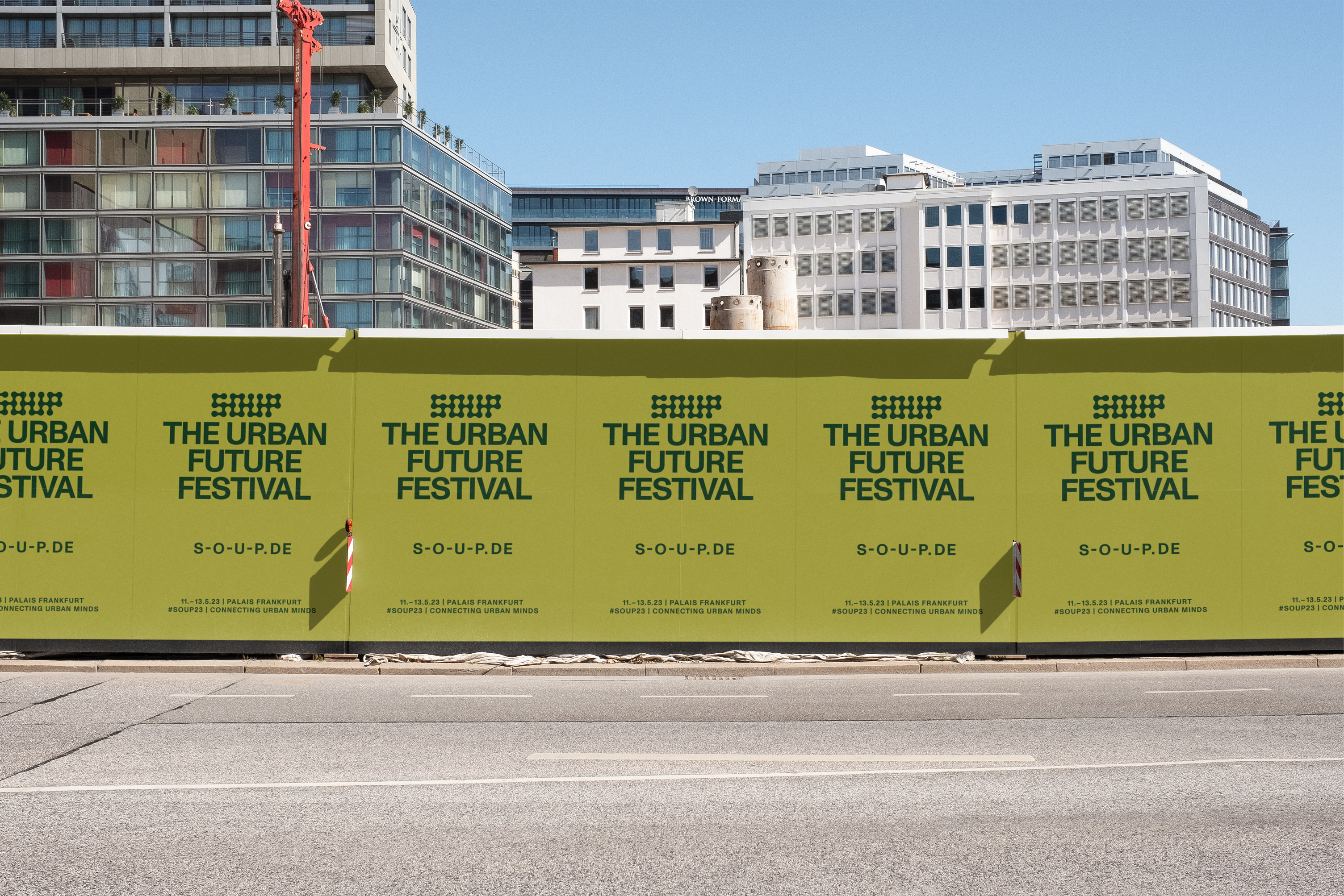
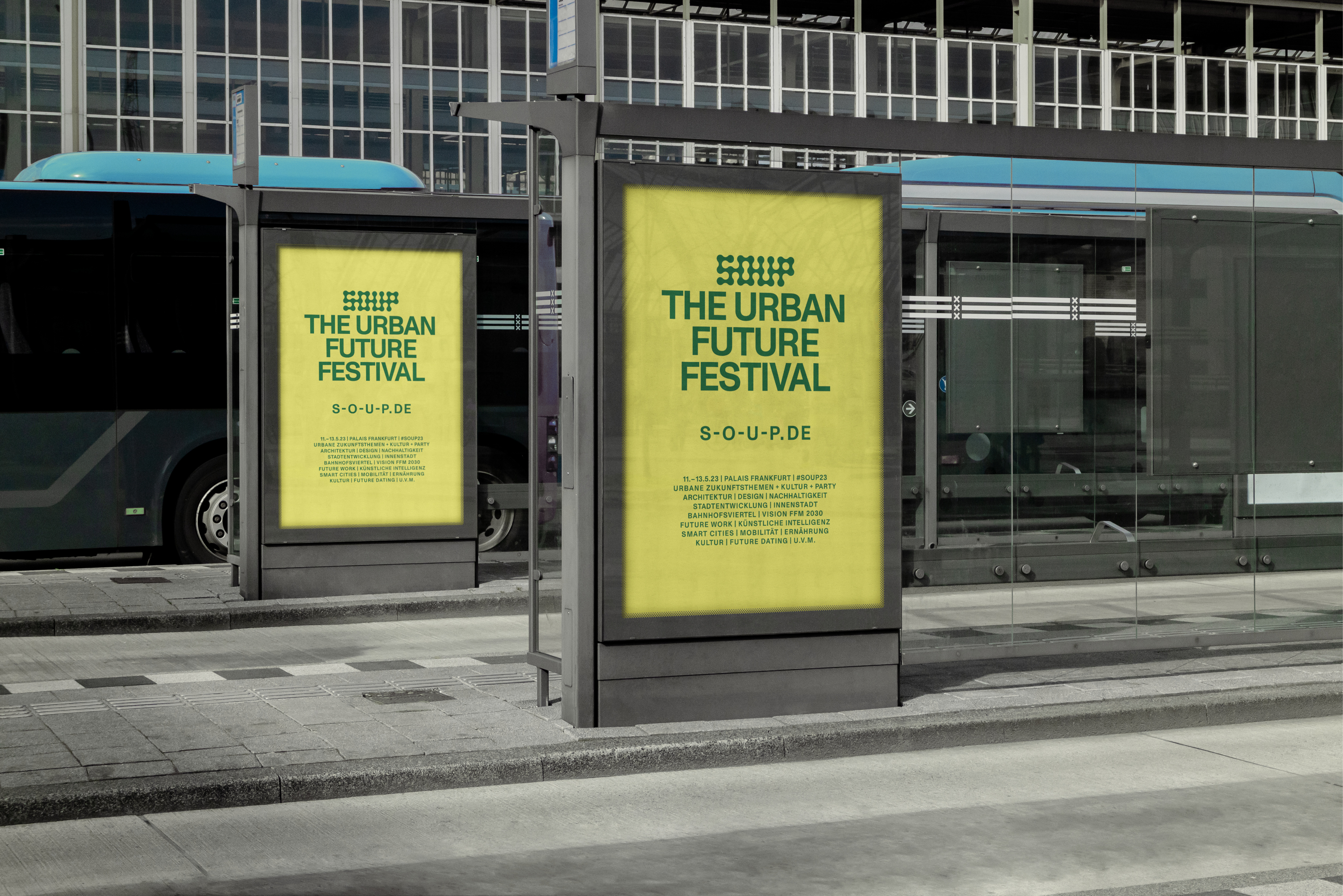
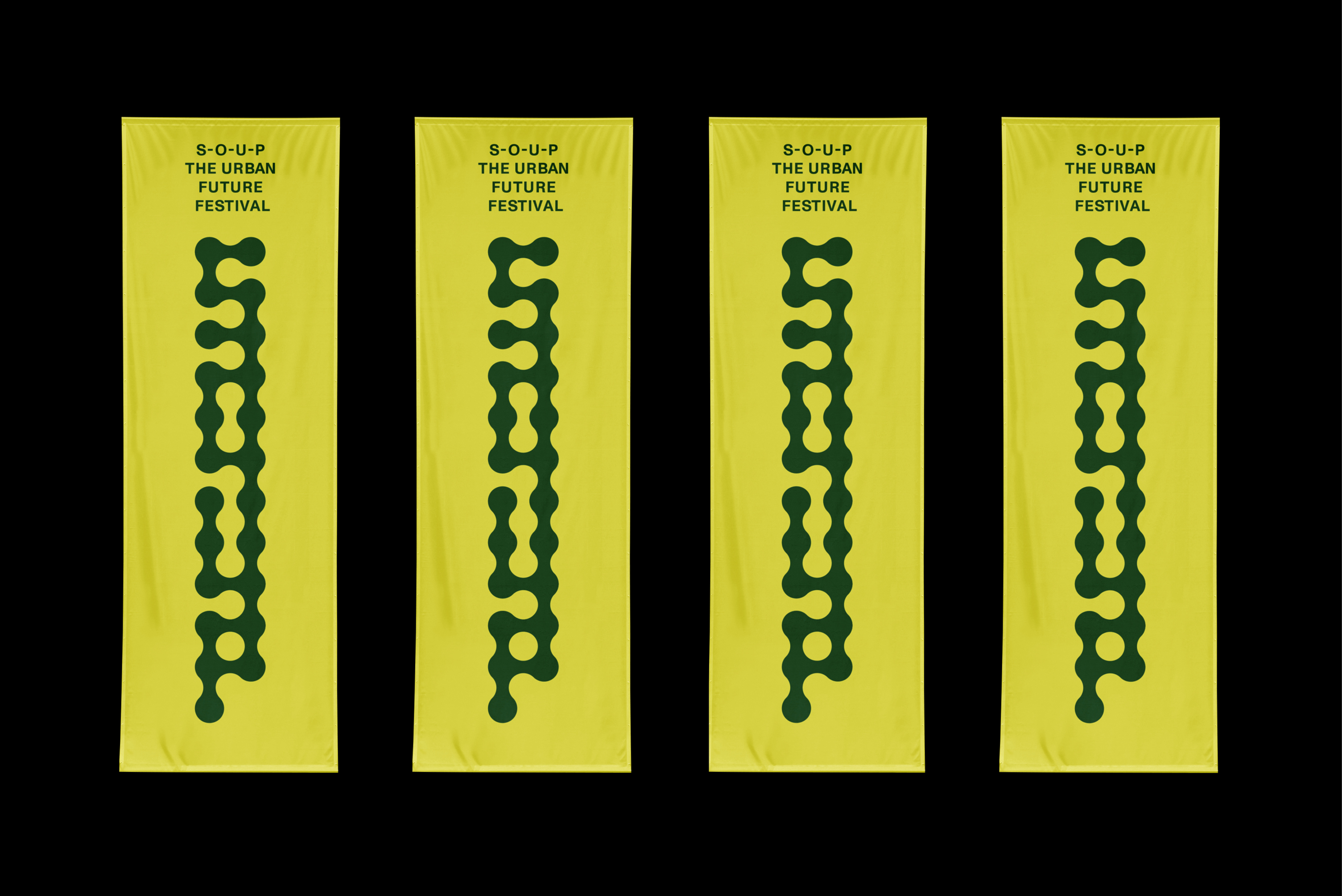
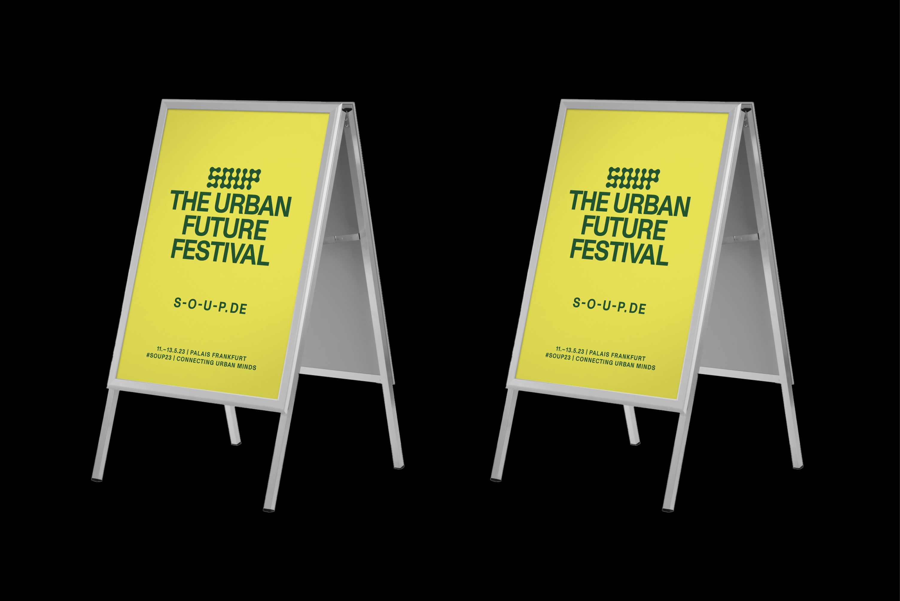
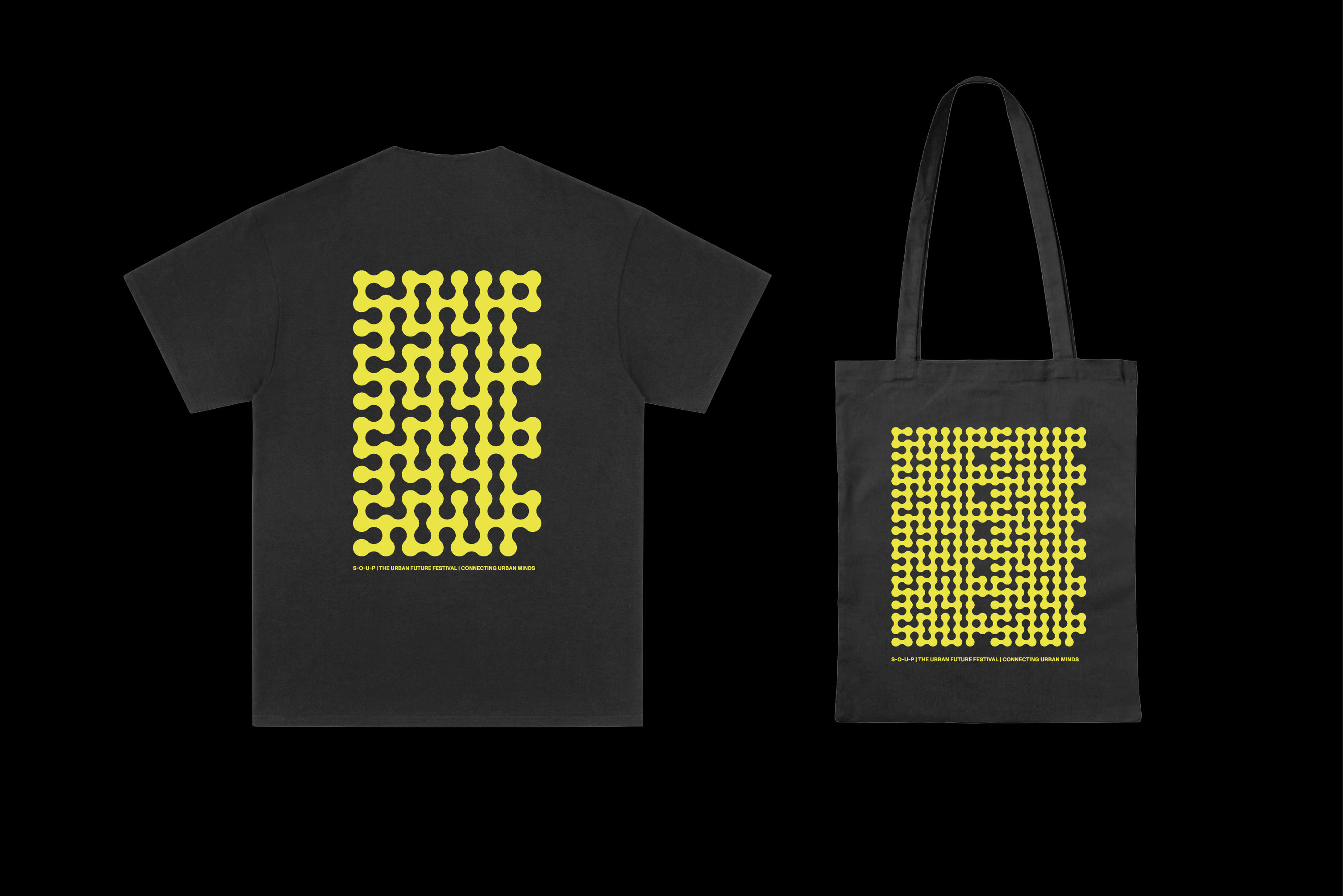
In spring 2023, I was commissioned to redesign the identity of the S-O-U-P | The Urban Future Festival. As part of this project, I worked on various elements, including the logo design as well as the design of posters and posters for the outdoor area, flags, banners, back walls, registration walls, T-shirts and much more.
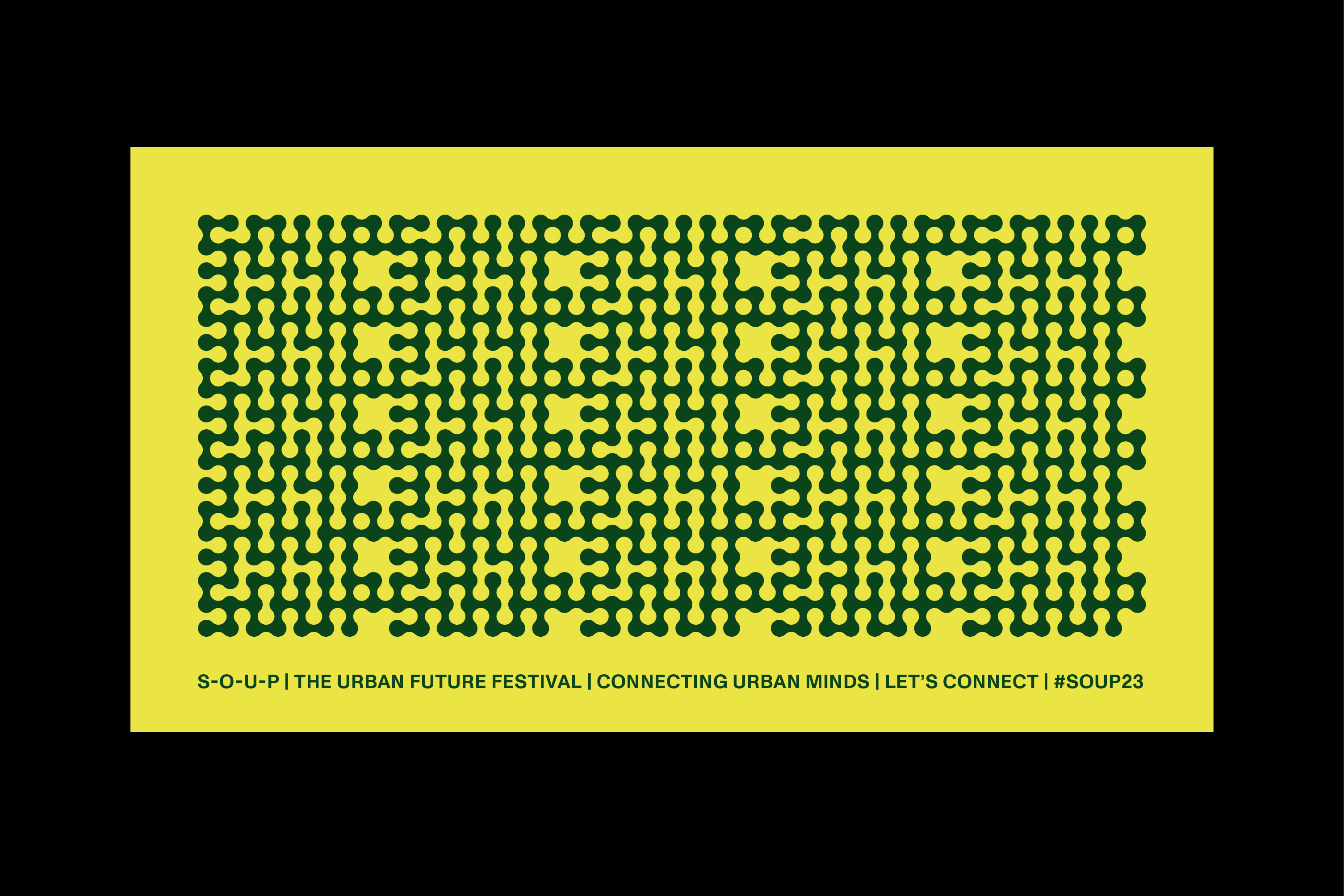
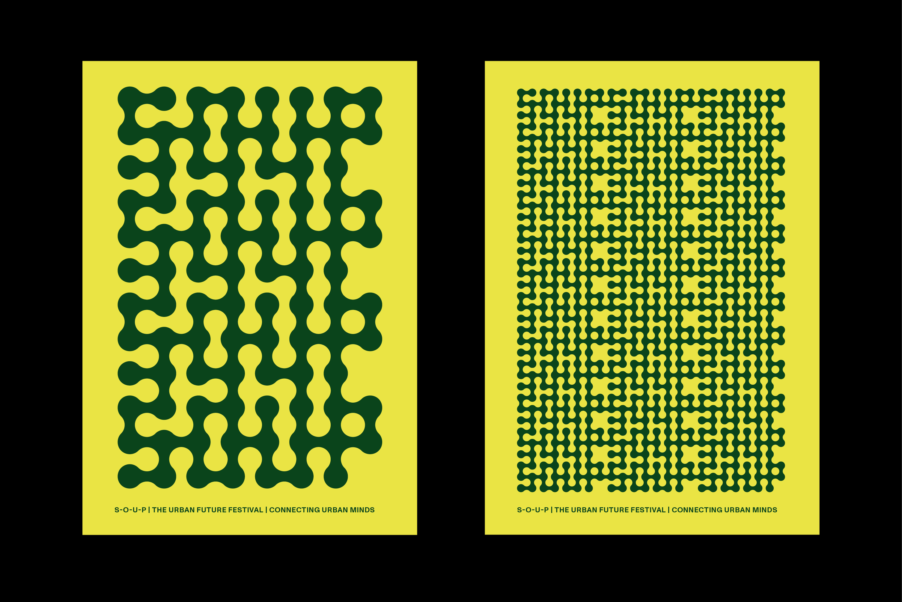
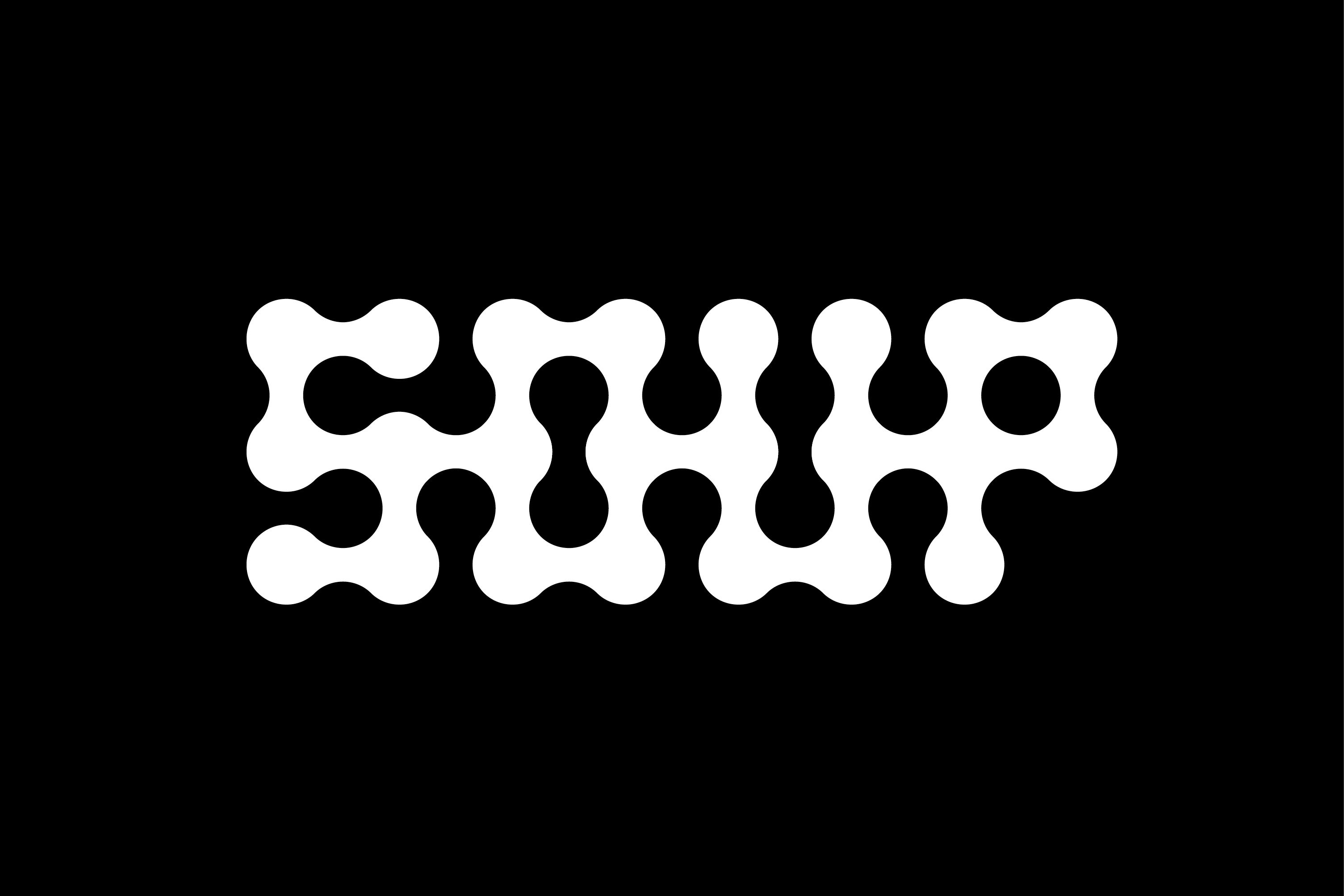
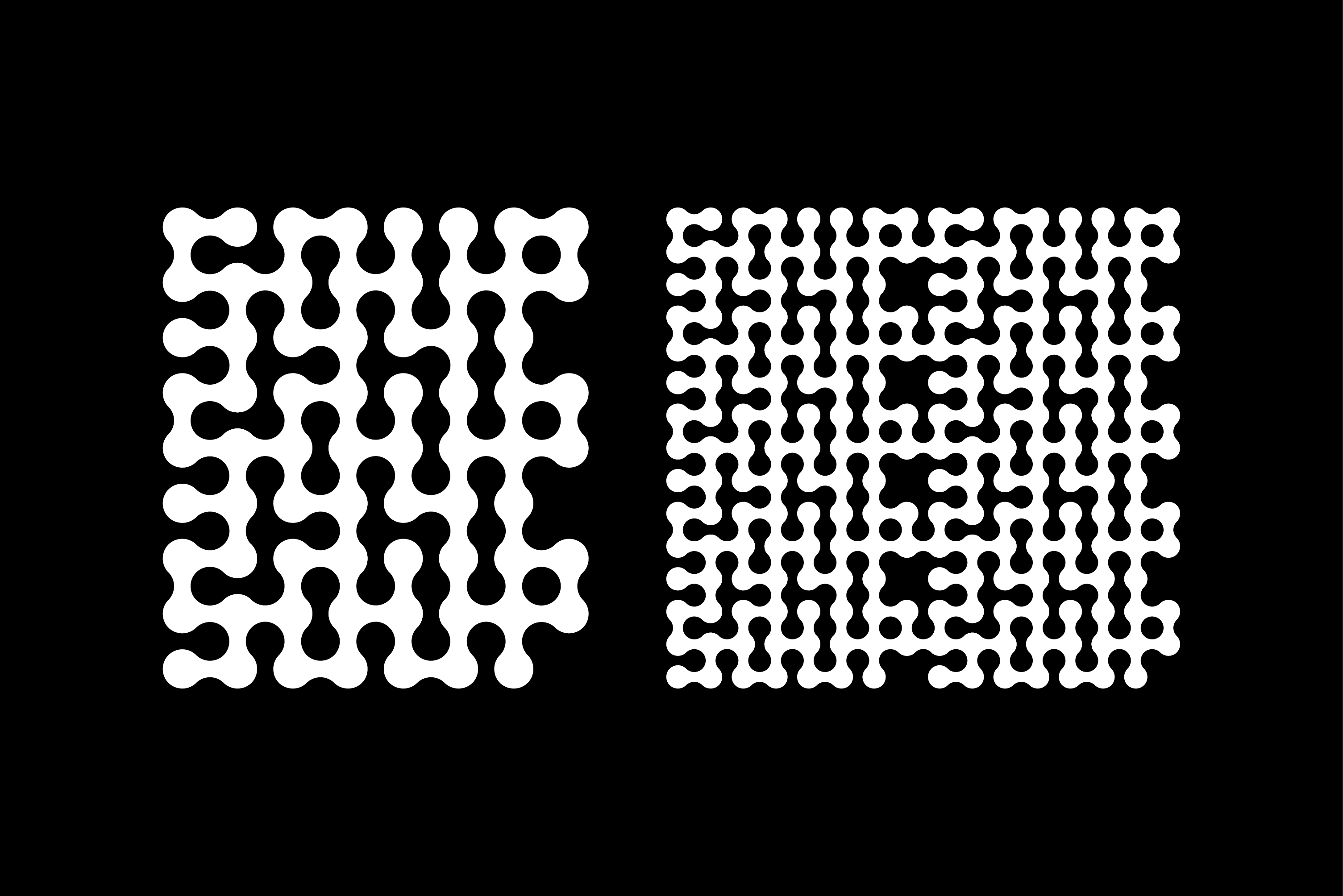
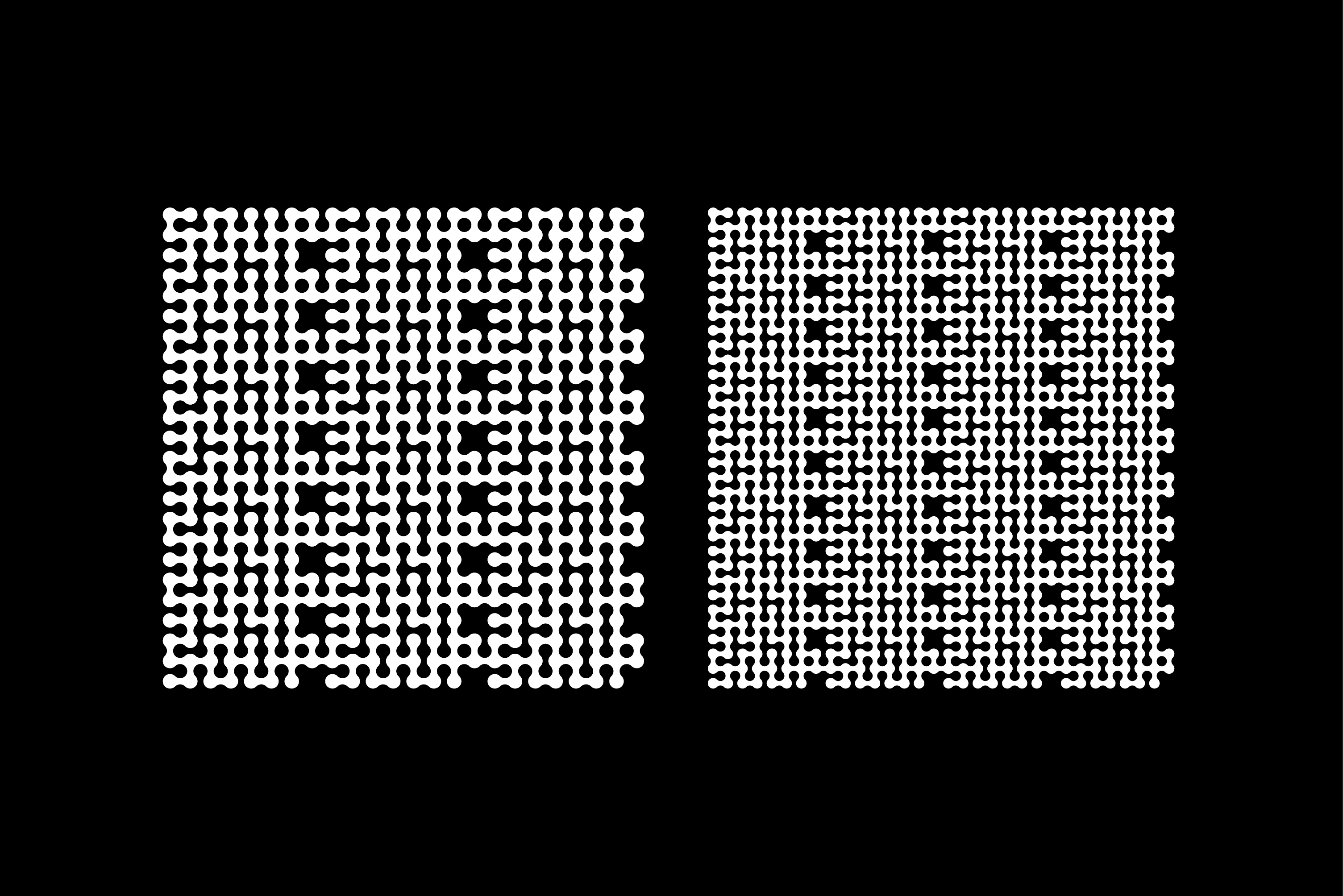
The modular logo is based on the “Metaballs” font from Maxitype. The festival’s claim, “Connecting Urban Minds”, served as a guideline for the application on various formats. The hyphens of the festival name merge with the letters and create a connection that can be infinitely multiplied horizontally and vertically. This design decision symbolises the ongoing connection within the urban community. To support the logo, the neutral font “ABC Monument Grotesk” by Dinamo was chosen, which is used both as a claim font and as a continuous text font. The colour scheme was adopted from the previous year's design in accordance with the S-O-U-P Festival guidelines to ensure continuity and recognition value.
S-O-U-P is the Urban Future Festival from and for Frankfurt on relevant urban future topics, from architecture and urban planning to mobility and technology, work and infrastructure, housing and real estate to gastronomy and culture. An interactive event with interdisciplinary participants and expert speakers. A mix of convention, education, networking, culture and party. Citizens, companies, institutions, politicians, experts and players in urban design come together to develop optimistic perspectives, new ideas and networks for our urban future.
General informations:
• Client: S-O-U-P
• Graphic design: Michael Satter
• Year: 2023
Technical informations:
• Formats: Various
• Typefaces: Metaballs and ABC Monument Grotesk
• Print: Various